
A Canva brand design checklist: make your first campaign look consistent
Use hierarchy, typography, spacing and export checks to create a coordinated poster, social graphic and presentation cover for a fictional brand.
For beginner designers, marketers, students and entrepreneurs
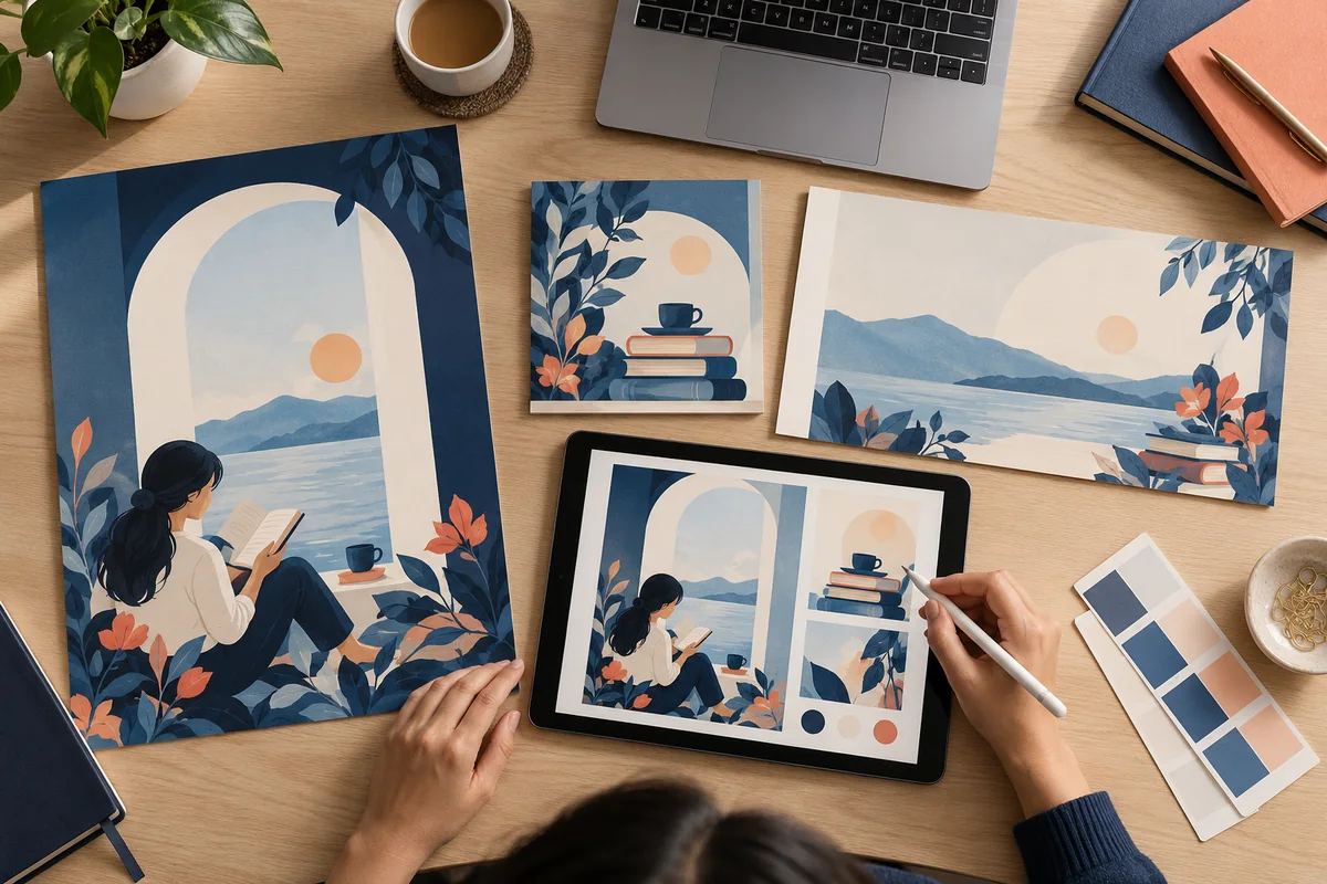
Define the message, choose a small set of colours and type styles, and use consistent alignment and spacing across your designs. Adapt each layout to its viewing conditions. Check contrast, spelling, image permissions and the required export format before handing over the files.
Start with a message rather than a template
Imagine a fictional neighbourhood reading club launching a weekend event. Create a poster, a social graphic and a presentation cover. The shared message is the event name, date and joining instructions. These three formats give a beginner a useful opportunity to practise consistency without making every layout identical.
Decide what readers should notice first and what they need to do next. Keep essential information away from busy imagery. Write the final text before refining the design, because an attractive template can still fail when a real event name is longer than its sample headline.
Build a small visual system
Choose one display style for headings, one readable style for supporting information and a limited colour palette. Record where each is used. Use alignment to create a clear edge and spacing to show which items belong together. You do not need a complicated brand manual to begin working consistently.
Avoid relying on colour alone to distinguish important details. A reader should still recognise the date and joining instructions if colours are difficult to distinguish. Review the layout at the size people will actually see.
| Element | A useful beginner rule |
|---|---|
| Headline | One clear message with enough room to breathe. |
| Supporting text | Readable size, short lines and a consistent style. |
| Call to action | Specific next step, visibly grouped with its destination. |
| Images | Relevant, permitted and not stretched out of proportion. |
Adapt the layout to each format
A printed poster viewed from a distance needs a different balance from a social graphic seen on a phone. Resize and rearrange intentionally. Simply shrinking the entire poster can make the date and instructions unreadable. Keep the visual identity consistent while changing the information hierarchy where needed.
For the presentation cover, reduce detail and make the title easy to read on a larger display. For the social graphic, inspect the smallest relevant viewing size. Ask another person what they noticed first and whether the next step was clear.
Export for the intended use
Confirm whether the receiver needs a screen image, a PDF or an editable source. Canva documents different file types and print settings; feature availability can depend on the account. For print, ask the printer about size, bleed and crop marks instead of guessing. Keep essential content within safe margins.
Open the exported file and check spelling, image quality, missing elements and page dimensions. A neat editor view is not the final quality check. Keep a separate copy of the editable original so revisions do not overwrite the approved version.
Create a portfolio entry that explains the brief
Show the coordinated set with a short explanation of your audience, type choices and revisions. Include one initial concept and explain how you improved it. Label fictional work honestly and avoid presenting a practice brand as a paying client. DigiDesign Pro covers design principles and accessible tools, helping you move from template selection to purposeful visual communication.
Common questions
Is Canva enough to begin learning graphic design?
It can be a useful practice tool. Begin with hierarchy, alignment, typography and colour; the quality of a design depends on those decisions as well as the tool.
Should every brand design use the same layout?
No. Keep the identity consistent, but adapt hierarchy and spacing to the format, audience and purpose. A poster and a presentation cover have different viewing conditions.
Sources & further reading
Official references checked on 2 October 2026. The practice examples and learning advice in this article are original eOS Master editorial content.
- Canva: Download file types ↗Official reference for choosing an export format.
- Canva: Margins, bleed and crop marks ↗Print preparation and safe-area guidance.